THE FINAL TRANSCRIPT: Tina Frank
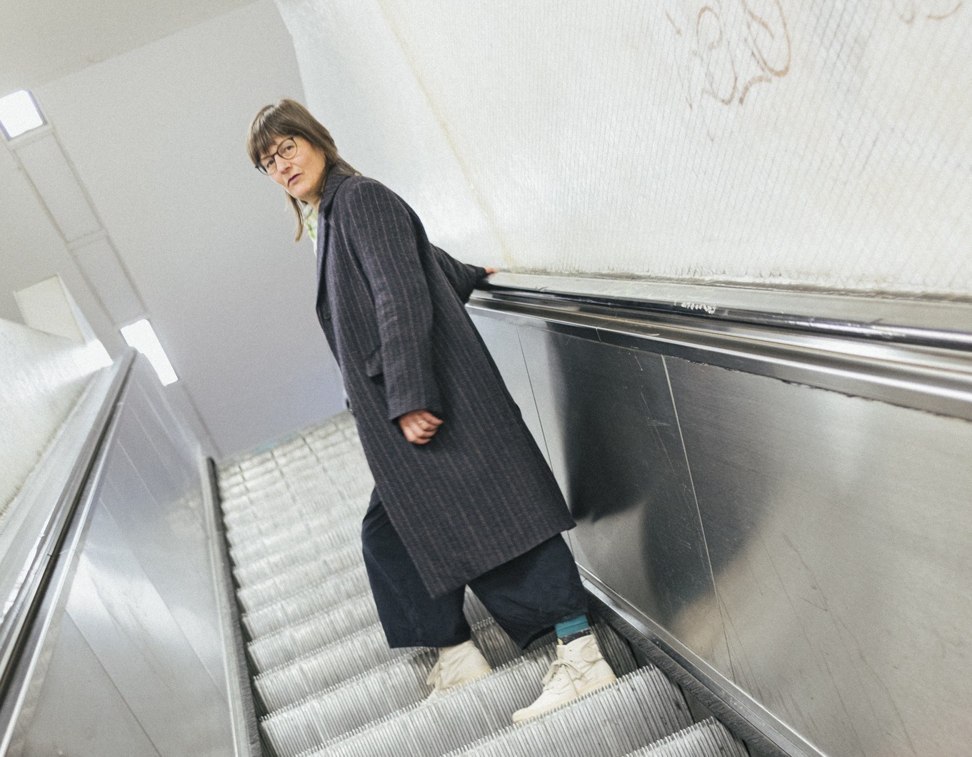
Since the 1990ies Tina Frank has been collaborating with musicians like Chicks on Speed, Peter Rehberg, Florian Hecker, Сон or General Magic to create audio-visual performances and installations presented all around the world. She created countless covers but is especially known for her design work for the viennese label Mego, later Editions Mego. Frank’s visualizations are characterized by an abstract formal language and an intense colorfulness that playfully explores the limits of perception and the materiality of images on screens. Tina is currently a visual artist, designer and professor at the University of Art and Design Linz where she is heading the Department Visual Communication at the Institute for Media.
“music held a different significance, embodying a certain lifestyle”
When you started studying graphic design in 1989, what was your relationship to music at that time? How early did you link design and music?
Back then, my interest in music was ranging from Hardcore to HipHop, influenced by my friends who were actively involved in various aspects of the music scene. Some were organizing small events, others were in bands, and some were connected to music through their writing. I enjoyed designing covers for the mixtapes I had copied from my friends’ records or creating posters for their events; one assignment in class was to design a cover and article for a fictional magazine. Of course i created a magazine for music – the cover image was a photo of a dancing person fully immersed in smoke.
Back then, music held a different significance, embodying a certain lifestyle. It required a trip to specialized record stores to obtain specific albums. I tried to buy one record each month and build a small collection over time. I’m not sure if that still applies today, when any music can be found online and be streamed immediately. It was pretty awesome to spend time with your newly purchased record: you looked at the cover while listening to each side, read the lyrics, sometimes even bought an album just because of the design – e.g. covers from 4AD created by Vaughan Oliver. The size of record sleeves before the CD made the experience of “immersing yourself in an artwork” a different one compared to the 1500 x 1500 px picture that represents an album on a smartphone nowadays. Imagine browsing through your friends’ record collection! There was an abundance of great design.
Your work is synonymous with electronic/computer music. Is the transition towards the digital equally significant to yourself too? I would imagine that your early practices were still analog, Photoshop 1.0 being introduced 1990.
No, the computer has always been my tool; I’ve worked with Photoshop and Freehand (the precursor to Illustrator) from the very beginning. The transition from analog graphic design to digital means occurred during my schooling years. In my first year, we still had to create a greyscale „Graukeil“ using poster paints on layout cardboard—simultaneously, there was digital training with an unfamiliar graphics program on a Windows computer. At that time, my cousin worked in one of the first digital printing studios, where I could sometimes sneak in to work on a computer to design posters. By the second year, I received my first Mac as a Christmas gift. From then on, I’ve always worked digitally. My musician friends from the band transitioned from guitars to samplers around 1990, roughly when I attended the graphic design school (from ’89 to ’92). My internship thereafter was at Erik Spiekermann‘s Metadesign in Berlin, where everyone was very experimental, and nearly all works were created digitally. As such, I’ve always considered myself a super early adopter of digital tools.
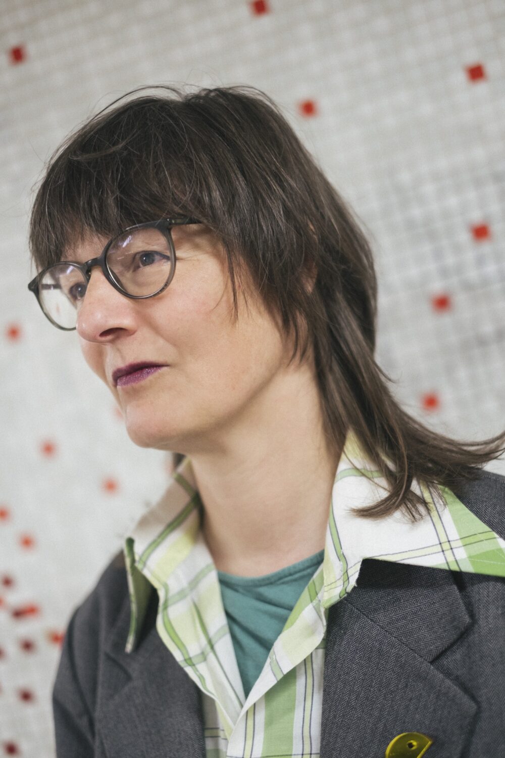
After mixtape covers and posters you started to do flyers and record covers for techno? What was the technical process and how did you perceive the scene?
It wasn’t until 1992, when I moved to Berlin, that I truly immersed myself in the vibrant techno and music subculture scene. Berlin was the epicenter, buzzing with energy and creativity. Heike, a friend of mine was already involved in designing graphics for the monthly 1000 Clubzine—a foldable, practical medium used to announce all the upcoming events for the month. She invited me to join in, and together with her friend Heidi, a photographer, we collaborated on various posters, flyers, and designs for the scene. We worked on client stuff at MetaDesign during the days and on music stuff during the nights. Soon, requests for designs started pouring in from acquaintances in Vienna as well.
The technical process of graphic design back then didn’t differ much from what it has been over the last 30 years. However, there were some notable differences. For instance, generative principles weren’t prevalent. When creating a digital image with Photoshop in 1994, it was quite an adventure. There was only a single “undo” function, and layers didn’t exist. This meant that each step in the process had to be carefully considered, as going back was a cumbersome task. We often had to wait around 20 minutes for the result of a process, and deciding whether to continue or undo was a pivotal moment. Saving intermediate steps was an option, but with limited storage space on our hard drives and external drives being impractical due to budget constraints, managing file sizes was crucial.

“Vienna’s scene was small but vibrant”
From early Rave to the beginning of Mego it was not a very long time. Please take us back to Vienna in 1994, how did you end up in this circle? Was the transformation from Techno to Post-Techno for you gradual or abrupt?
In the spring of 1994, I made the decision to leave Berlin and return to Vienna. At that time, Vienna’s scene was small but vibrant. I recall attending an illegal rave on New Year’s Eve, somewhere on the outskirts between Vienna and Lower Austria. Soon after, Peter Rehberg organized what became known as “Club Duchamp” at the Bluebox—a night dedicated to obscure music. I vividly remember vinyl records featuring scientific audio recordings, such as the sound of a healthy or sick human heart, and performances by artists like Jimi Tenor. Perhaps Club Duchamp didn’t kick off until 1995 or 1996. For us, everything began to take shape in 1995.
I often heard that the success of Mego is closely connected to the rise of the internet and their use of it. I myself became a graphic designer in 1999 and was fascinated by how experimental web design felt back then. I vividly remember the Mego page and all the Silver Server/Shockwave experiments from Dextro and Lia. How was that era for you from a design but also from a sociological perspective?
I wasn’t even aware that your background was initially in graphic design. What prompted you to move away from that discipline?
“exploring the possibilities of the internet, digital music / design / interactivity, combined with self-employment and entrepreneurship”
I was one of first to do the “Medienfachmann Lehre” and i really loved it initially. But my workplace was a bit sketchy. I remember that at the end they wanted me to do an ad for the FPÖ!
Towards the end of 1994, I decided to become self-employed and began searching for a studio space. The founders of Mego—Andi, Ramon and Peter—were my friends and as Mego was just launching around the same time, they were in need of a studio space as well. When they were in Berlin recording “Fridge Tracks” in December 1994, I found a newly renovated place in an old factory in Vienna’s 12th district. Thus, our journey began in January 1995. Simultaneously, the era of visual internet dawned with the introduction of the first web browser. EUnet, Austria’s only provider at the time, held a competition for the most beautiful homepage. We designed and programmed a website for Mego and submitted it. While we didn’t win, it provided us with expertise in web design and programming, leading to additional projects. That same year, along with Andi and Ramon and Klaus as a manager, we founded URL—a design agency specializing in information design, which soon served clients across Europe and beyond.
From then on, we operated simultaneously as a company for online clients, a music label for electronic music, and I, as a designer for digital presences on the internet and for record covers for Mego and others. Mego also quickly developed its own online mail order service for electronic music—m.dos. Being at the forefront of technology and music was a natural progression for us. Soon, around Mego more people joined—individuals interested in the convergence of music and digital technology. Regular gatherings in the evenings and on weekends served as hubs for exchange.
Dextro and I were classmates at the „Graphische“, and I soon became acquainted with Lia. Oskar and the people from Silverserver were also familiar faces. We were all keen on exploring the possibilities of the internet, digital music / design / interactivity, combined with self-employment and entrepreneurship. There were no established rules for our creations; we were actively shaping the rules for new forms and formats. Early on, we developed a “Jukebox” for m.dos based on shockwave, enabling users to stream music. Bart, a designer and coder who had just moved from Belgium to Vienna, worked many hours to make that possible.
“shaping the rules for new forms and formats”
Yes m.dos! AI is at the moment revolutionising everything in a similar way like the computer did in the 90ies. Are you excited by that prospect?
Well… It’s not as easy for me to dive into new technologies as it used to be. Over the past 10 years, I’ve found myself drawn more towards analog video synthesizers and the theoretical aspects of my work as a professor at the University of Arts Linz. Unfortunately, that has meant having less time to really dive deep into the latest technical developments. I’m excited to see the younger generation experimenting and pushing the boundaries of what’s possible.
The digital realm is certainly captivating, but I find myself increasingly drawn to hybrid approaches that combine digital and analog elements. Analog possesses the quality of longevity and archival value combined with a physical understanding of the passing of time. There’s something about the tangibility and three-dimensionality of the physical world that I believe is essential for truly understanding our place and relation to others. Immersive experiences involving light, space, materiality, sound, scent, and human touch – those are what really intrigue me now, more so than whether something was produced with AI or other tools.
The societal transition towards AI-assisted or AI-driven activities is happening ultra fast, but the potential impact could be quite stark – job losses, erosion of specialized knowledge and skills as we become over-reliant on automated decision-making. There will be segments of society able to afford an abundance of specialized AI assistants and those who cannot. AI will not help alleviate the growing disparities in society. And the energy and water demands of AI processing could further exacerbate the pressing issue of climate change. Still, I can’t deny the allure of exploring the new and simply diving in to see what’s possible. It’s a constant balancing act, isn’t it?

Director: Florian Hecker, Tina Frank
Concept & Realization: Tina Frank
Sound: Florian Hecker
“an exploratory, DIY mentality”
When you did your first Mego designs, did you have a point of reference, or other designers you looked up to?
I didn’t have a strong academic design education; my design journey was shaped by hands-on experiences and my influences came from the people around me—the designers at MetaDesign Berlin, the musicians I worked with, and the friends I discussed ideas with. It was a time marked by postmodern design approaches and a vernacular/no rules design ethos coupled with new, previously unseen digital possibilities. If I was to point to a role model or someone who inspired me, the works of April Greiman would be a fitting example.
My approach has always been one of “bricolage” – tinkering and experimenting with what’s possible using the materials and tools at hand, which were digital. It was never about following trends or famous designers, but more about an exploratory, DIY mentality – seeing what I could create by combining different elements in unexpected ways. The rapid technological changes opening up new creative avenues were a big part of what drove and inspired me during that time.
Especially in music, aesthetics play a huge role as a separator/identifier. How much of that is found in our work?
Is that so?
“shifting meanings and contexts”
I think that subculture was somewhat defined by it. Creating a contrast/alternative to what was dominant in mass media: Noise VS harmonic, fast VS slow, vice versa, etc .. I think that the internet changed that dynamic quite a bit though!
Alright, when we look at the example of punk in the 1970s, their aesthetic was clearly and radically different from the mainstream tastes and heavily challenged societal norms. Similarly, alternative Viennese music labels like Cheap Records or Mego aimed to present a distinctly different appearance. What later became defined as “electronic music” was certainly aiming to differentiate itself from techno music. However, at Mego, we also started early on to work against prevailing trends and expectations. For instance, on Kevin Drumm’s release “Sheer Hellish Miasma”, we used a Blackletter typeface, typically associated with heavy metal music.
The point is that playing with aesthetics and visual codes is what makes design so genuinely exciting, as it allows for shifting meanings and contexts accordingly. Nowadays, music that exists between typical genre boundaries is far more interesting to me than music that can be clearly categorized into a single genre. I find myself wondering – would it even be possible today to provoke with aesthetics in the same way the punk movement did back then?
When you design something for a musical work, what is your preferred way of going about- Listening to the music, picking the artist’s thoughts..?
When designing visual elements for music, it really comes down to listening to the music, talking with the artist, and trying to understand their thought processes. My goal is to identify principles in the music or the creative process that can be translated into a visual language.
During my ongoing experimentation with various tools and approaches, I sometimes stumble upon a visual concept that harmonizes perfectly with the music or the artist’s vision. This constant exploration of my visual vocabulary is a crucial aspect of my work. It might just happen for something to emerge that fits the requirements of a specific project. Requests for cover art or other visual representations of music often come from artists who appreciate my previous work and share a similar mindset. It’s quite likely that I’m working on something that already resonates with the artist’s idea.
Creating a design for music is a collaborative process that involves channeling the essence of the music through visual language, through concept, discussion, and adjustments. And I’m always open to those unexpected moments of synchronicity.
If the music sounds horrible to you, would you be able to make a decent cover?
🙂 no way.
I emphasized a lot on your design work, but you are also very well known for (live) video works. Again, I myself started to work in this field around the millennium and saw it changing quite drastically a couple of times. From exciting new artform to cheap entertainment at raves and back again. How did you perceive this evolution and how would you describe the current state?
As for the current state of (live) video art form, I prefer to speak in terms of audiovisual works. Because truly, there is (almost) no live video without sound. In the realm of electronic music, it’s almost unthinkable these days to have a performance that is solely focused on the music alone. Visual accompaniment has become an integral part of the experience.
Interestingly, in most of all cases, the musicians themselves are the ones being booked, and they bring their visual collaborators along with them. In the past, the musician was the marketable face on the poster, while the visual side were secondary. Now, both the musical and visual artists are equally credited – which I think is a positive evolution.
In the film world, it’s often the reverse: the image takes precedence, and musicians are approached to produce a soundtrack for an already conceived or even produced image. Of course, this is a simplified representation, and there are many examples where the boundaries blur, and the creation of image and sound mutually inform each other through a discursive/productive collaborative process. Sound plays such a powerful role in how we perceive and emotionally respond to moving images—it can counteract the image or shift the emotional tone of the scenes in completely different directions compared to just the visuals alone.
I’m deeply fascinated by this interface—how meaning and significance shift when sound and image come together. I love the live play, the improvisation as a principle of creating images. I particularly enjoy the thrill of public performance. So I suspect I’ll remain true to this art form. My belief is that we’ll see all sorts of other realms emerge in the future where a fusion of sound and image in a live context can be explored and experienced. Because it’s hands-on, it involves human engagement, it’s an ancient human technique, and it happens in the moment—allowing for the unexpected to unfold.
Thank you!
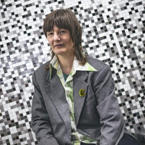
Tina Frank

This article is brought to you by Struma+Iodine as part of the EM GUIDE project – an initiative dedicated to empowering independent music magazines and strengthen the underground music scene in Europe. Read more about the project at emgui.de
Funded by the European Union. Views and opinions expressed are however those of the author(s) only and do not necessarily reflect those of the European Union or the European Education and Culture Executive Agency (EACEA). Neither the European Union nor EACEA can be held responsible for them.